A luxury tour that finally looks like one.
Seven stops, a €750 private minivan, and TripAdvisor reviews from across Europe and North America, presented with the restraint of a premium Irish tourism brand.
Visit the live site →avocadaytour.ie01 The problem
The Avoca Wicklow Day Tour is a genuinely exceptional product: a private chauffeured journey through some of Ireland's most photographed landscapes, run by a family with decades of local knowledge and glowing reviews in five languages. The original website told a very different story.
Cluttered, visually inconsistent and built on a generic template, it actively undercut the experience it represented. At the premium end of Irish tourism, where a guest is choosing between this and a luxury hotel experience: the website is the first and most critical trust signal.
The digital presence has to match the physical experience.
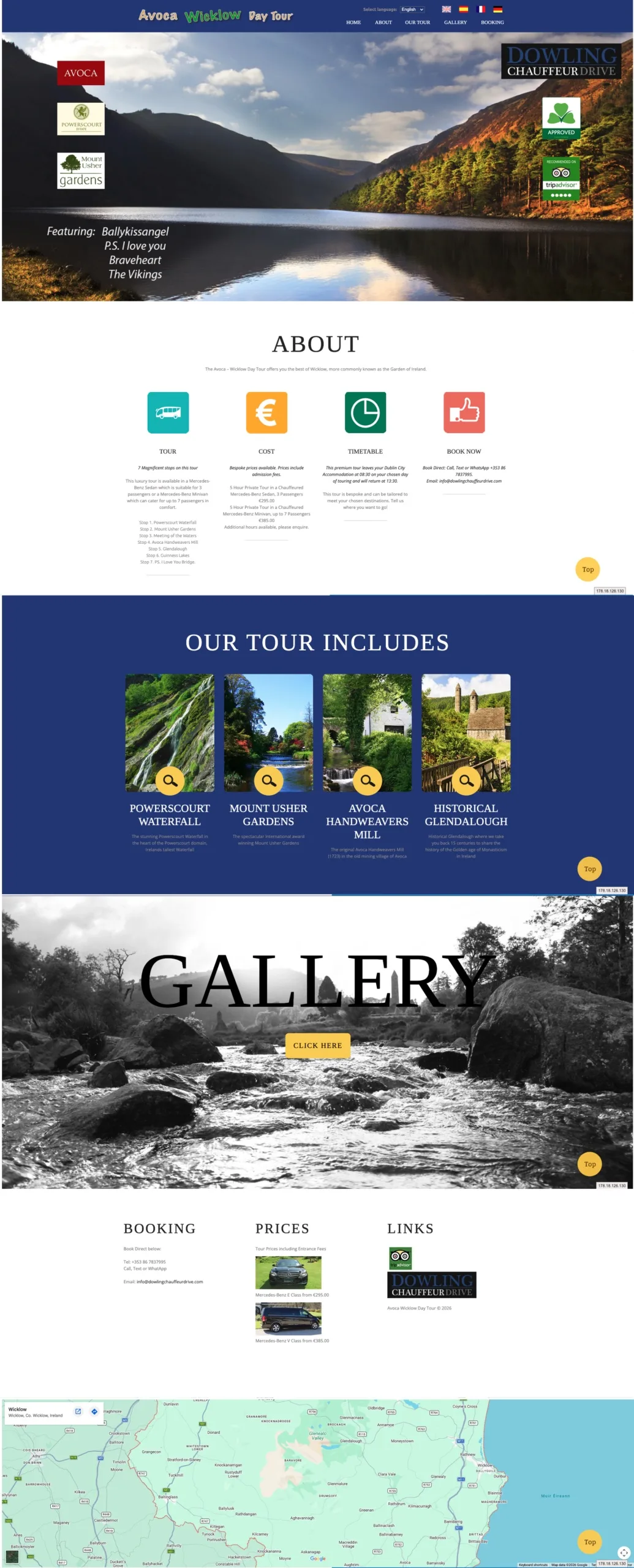

Full-page captures. Scroll each panel to compare.
02 What the original got wrong
Conflicting identity
Multiple logos and competing widgets with no clear hierarchy. The redesign introduces a single cohesive dark navy identity with warm gold and white.
Low-quality visuals
Heavy use of stock-style icons and small imagery. Every section now leads with full-bleed landscape photography.
Visual whiplash
Clashing background colours with no coherent system. Replaced by a controlled typographic hierarchy, Playfair Display headings, Manrope body.
Buried pricing
The €750 price point was hard to find and presented without confidence. It now sits prominently, filtering for serious bookers.
No social proof
TripAdvisor reviews in English, French and German were not woven into the page. They now surface at the point of maximum hesitation.
No upsell path
The wider Dowling portfolio had no elegant presentation. A Bespoke Luxury Tours section turns one booking into a repeat relationship.
03 Key design decisions
Six choices that changed how the brand is perceived from the first scroll.
Full-viewport hero
A cinematic opening image of the minivan against the Wicklow hills anchors the brand in premium transport before a word is read.
Price up front
The €750 figure is shown without apology, filtering in serious bookers and signalling the experience justifies the investment.
Reviews woven in
Multilingual guest testimonials are integrated into the page flow rather than hidden in a footer, building trust where hesitation lives.
Visual journey gallery
A rich multi-image gallery of all seven stops replaces the old button-to-gallery link.
Bespoke tours upsell
Six further experiences presented as a curated collection: Cliffs of Moher, Belfast, Kerry, Whiskey, Golf and Dublin City.
Contact simplicity
A concierge-style form with US Toll Free, Irish mobile and WhatsApp all immediately accessible.
04 Brand palette
05 Results & outcomes
| Deliverable | Outcome |
|---|---|
| Visual identity | Unified navy, gold and linen palette replacing a cluttered multi-colour template |
| Hero section | Full-viewport cinematic imagery replacing a text-heavy above-the-fold |
| Pricing | €750 prominently anchored: from buried text to a confidence signal |
| Social proof | Multilingual TripAdvisor reviews integrated into the page flow |
| Tour stops | All seven stops presented with dedicated imagery and descriptions |
| Vehicle fleet | Ford Tourneo, Mercedes E Class and V Class presented with pricing |
| Upsell architecture | Six Bespoke Luxury Tours presented as a curated collection |
| Contact & booking | Concierge form with US Toll Free, Irish mobile and WhatsApp surfaced |